Tables are an easy way to organise your content into rows and columns. They have multiple options for customising these tables to best fit the data you want to include in them.
- Creating a table
- Editing a table
Creating a table
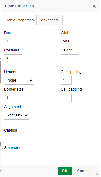
When first adding a table, a pop-up will appear asking what properties you want your table to have.
- Number of rows
- Number of columns
- Width: By default this is set to 500 pixels. Much like images, it can be useful to change this to a percentage. Making this 100% will make the table the same width as the content placeholder it sits within.
- Height: This can be restricted, but is blank by default. It may be easiest to leave this value blank.
- Header: You can choose whether to give the first row, first column, or both a header like styling. Having headers on your table helps with accessibility.
- Cell spacing/padding/border: You can choose how much space there should be between cells/how much padding there should be around a cell/how thick the border lines should be. These are all set to 1 as a default.
- Alignment: Choose the universal alignment of the table cells (left/right/centre).
- Caption: A title for your table which concisely describes what the title shows. This is important for accessibility.
- Summary: A slightly longer description of the content and structure of the table. This is important for accessibility.
You can see how these properties are shown in the picture below.
Editing a table
Once you’ve entered a table into your page, editing the table is fairly straightforward, you simply need to right click in the relevant place.
When doing this, you’ll see options to:
- Edit the properties of the particular cell you’re on (see below for more details).
- Add or delete a row.
- Add or delete a column.
- Delete the table entirely.
- Access the table properties, as described above.
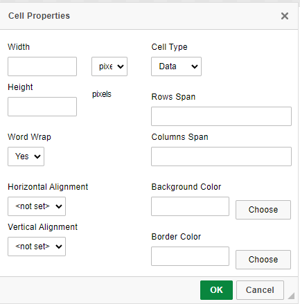
Cell properties
Accessing the cell properties allows you access to a number of customisation options for the particular cell/cells you’re editing. You will have access to the following options:
- Width: You can restrict the width of this particular cell/cells to a particular number or pixels or a particular percentage. Using a percentage here can be useful as it will allow the table to resize properly on different screen sizes. Note, enforcing a particular width for one cell will also enforce that same width for all other cells in the same column.
- Height: You can restrict the height of the cell/cells if needed (though this is unlikely). As with the width, restricting the height of one cell will enforce the same height for other cells in the same row.
- Cell type: Switch between “data” (plain styling) and “header” (header styling).
- Word wrap: Choose whether text in the cell automatically wraps or not.
- Horizontal/Vertical alignment: Choose the alignment of data in the cell (left/right/centre).
- Background/Border colour: Choose a colour from a colour picker to change the background or border of the particular cell/cells.
You can see these options in the picture below.
 Top accessibility tips
To make you tables as accessible as possible, it is important to add table headers which highlight the first row and/or first column.
It is also advised to add a table caption which is a title describing the table, and if the table layout is quite complicated then add a table summary which describes the structure of the table to help users.
These are all options in the table properties popup.